
How to add additional dynamic color scheme to the theme settings? (Update July 2023)
Creating an additional dynamic color scheme to the theme settings enables you to easily customize another color scheme for background, fonts, button labels, and else. This allows merchants to have more color options and hence, give them more customizable options without the need of coding anything. In this guide, we’ll look at on how to add additional background color to the theme settings, which can be used further in theme’s sections (e.g. in the image with text section). As usual, we’ll use Dawn theme.
Update July 2023: Easily chance your store’s color schemes (no coding!)
In the summer Shopify editions announcement, Shopify revealed exciting news regarding the latest version of Shopify free themes, such as Dawn theme. Now, you can create and customize color schemes for your store without writing a piece of code.
With these newly crafted color schemes, you can elevate the visual appeal of your store’s sections, making them stand out like never before. This update empowers you to establish a unique and consistent branding experience across your entire store.
Check out the step-by-step guide on setting up color schemes, illustrated with the example of Dawn theme 11.0.0.
- Go to your Shopify admin.
- Ensure your theme is up to date with the latest version.
- Click on “Customize” to begin customization.
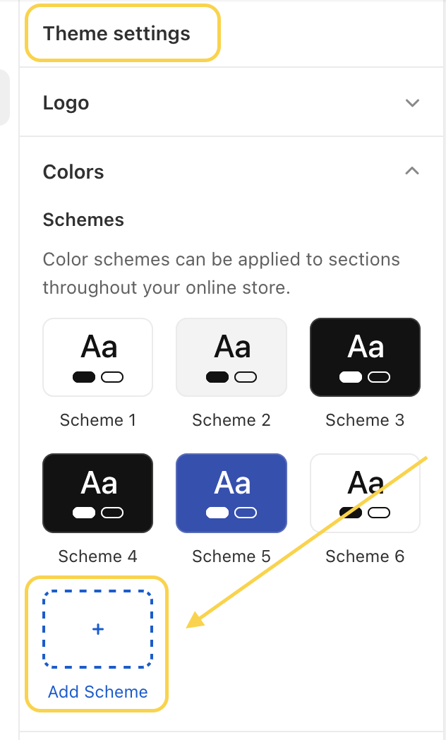
- Navigate to “Theme Settings” and select “Colors”.
- Click an existing scheme to change the colors or click “Add scheme” to add a new color scheme.
- Click the color swatch to choose your colors. The color field accepts color names such as red, black, or blue, RGB color codes, and hexadecimal color values. Optionally, set up a background gradient if desired.
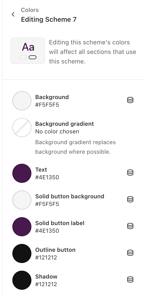
- Save the customized color scheme.
- Choose the specific section where you want to apply the newly created or edited color scheme.
- In the section settings, find the dropdown menu and select the desired color scheme.
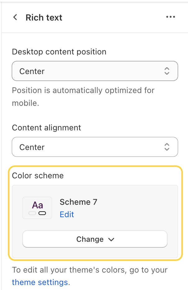
- Save your changes.
Adding a color scheme – code solution
If your current theme does not have built-in support for adding a new color theme through the theme settings, you’ll need to make adjustments in the source code. Below is a guide to help you set it up.
Files you need to change
To create a new dynamic color scheme, we’ll need to make changes in the following files:
- config/settings_schema.json
- config/settings_data.json
- layout/theme.liquid
- assets/base.css
- any section files, you would like to add the option to select another background color (in our example, it’s gonna be image with text section)
config/settings_schema.json
This file controls the organization and content of the Theme settings area of the theme editor. All setting selections in the theme editor are saved in settings_data.json. We’ll add the following code snippet (adding background color and gradient) into this file (find the section with background colors):
  {
    "id": "gradient_background_2",
    "type": "color_background",
    "label": "t:settings_schema.colors.settings.gradient_background_2.label"
  },

  ADD THE FOLLOWING CODE:
  <-- Start: Adding new background color scheme -->
  {
    "type": "color",
    "id": "colors_background_3",
    "default": "#FFFFFF",
    "label": "Background 3"
  },
  {
    "id": "gradient_background_3",
    "type": "color_background",
    "label": "Gradient background 3"
  }
  <-- End: Adding new background color scheme -->
Note: You can of course add translations for labels. I don’t use them in our example to make it simpler. However, I recommend using the translations when you’re e.g. building a new theme.
config/settings_data.json
This file contains the setting values for a theme based on the settings included in settings_schema.json. The settings_data.json file has two parent objects:
current(This object contains all of the setting values that are currently saved in the theme editor.)presets(This object contains an object for each theme style – Dawn theme, version 7.0.0, has one theme style “Default”. Each object is in the same format as current.)
Add the background color in both objects as shown below (once in the current object and once in presets object).
{
"current": {
"colors_solid_button_labels": "#FFFFFF",
"colors_accent_1": "#121212",
"colors_accent_2": "#334FB4",
"colors_text": "#121212",
"colors_outline_button_labels": "#121212",
"colors_background_1": "#FFFFFF",
"gradient_background_1": "",
"colors_background_2": "#F3F3F3",
"gradient_background_2": "",
ADD THE FOLLOWING COLOR
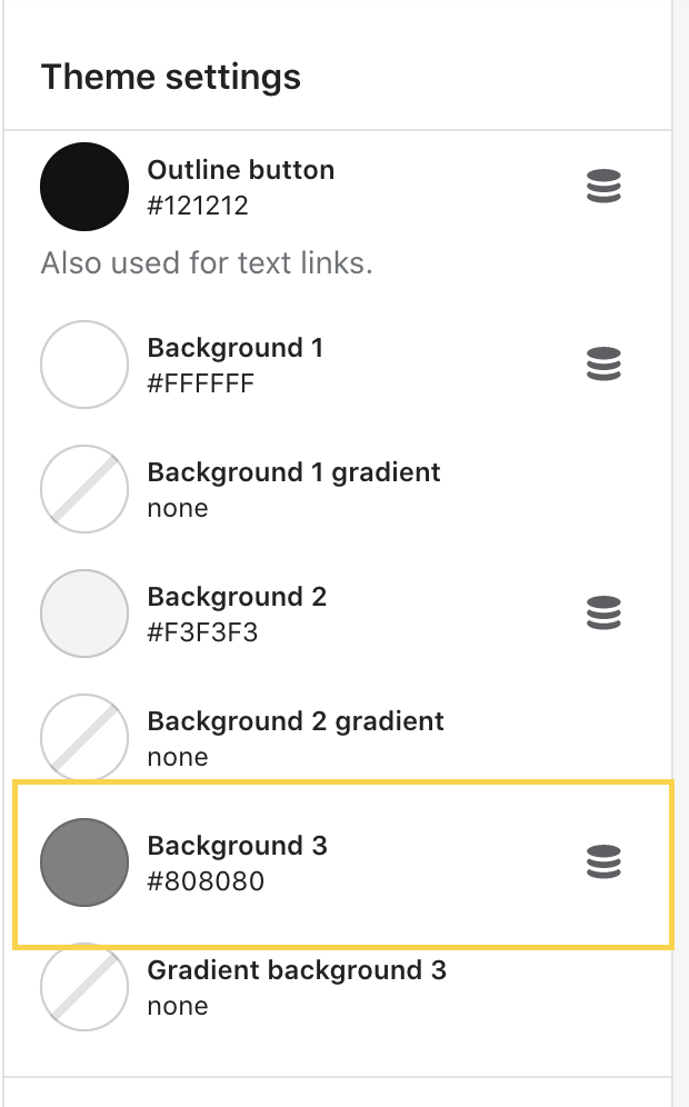
"colors_background_3": "#FFFFFF",
"gradient_background_3": "",
.....
layout/theme.liquid
Layout/theme.liquid file is the default layout, which usually contains two main Liquid objects:
content_for_headercontent_for_layout
We’ll add the background color to the content_for_header object (this object dynamically loads all scripts required by Shopify into the document head).
    ...
    --color-base-background-1: {{ settings.colors_background_1.red }}, {{ settings.colors_background_1.green }}, {{ settings.colors_background_1.blue }};
    --color-base-background-2: {{ settings.colors_background_2.red }}, {{ settings.colors_background_2.green }}, {{ settings.colors_background_2.blue }};
    ...

    ADD THE FOLLOWING CODE - BACKGROUND COLOR
    --color-base-background-3: {{ settings.colors_background_3.red }}, {{ settings.colors_background_3.green }}, {{ settings.colors_background_3.blue }};

    ...
    --gradient-base-background-1: {% if settings.gradient_background_1 != blank %}{{ settings.gradient_background_1 }}{% else %}{{ settings.colors_background_1 }}{% endif %};
    --gradient-base-background-2: {% if settings.gradient_background_2 != blank %}{{ settings.gradient_background_2 }}{% else %}{{ settings.colors_background_2 }}{% endif %};
    ...

    ADD THE FOLLOWING CODE - COLOR GRADIENT
    --gradient-base-background-3: {% if settings.gradient_background_3 != blank %}{{ settings.gradient_background_3 }}{% else %}{{ settings.colors_background_3 }}{% endif %};
assets/base.css
Now, we need to add the background color to the base CSS file so that the colors. We’ll need to add the background color to :root and body like this:
    .color-background-2 {
        --color-foreground: var(--color-base-text);
        --color-background: var(--color-base-background-2);
        --gradient-background: var(--gradient-base-background-2);
    }
    .color-background-3 {
        --color-foreground: var(--color-base-text);
        --color-background: var(--color-base-background-3);
        --gradient-background: var(--gradient-base-background-3);
    }

    :root,
    .color-background-1,
    .color-background-2,
    .color-background-3 {
        --color-card-hover: var(--color-base-text);
    }

    body,
    .color-background-1,
    .color-background-2,
    .color-background-3,
    .color-inverse,
    .color-accent-1,
sections/image-with-text.liquid (or any other section file)
Now, we need to enable to select the additional background color in the specific section(s). The example will be shown on the image with text section. We will add the new background color scheme to the section’s settings (you can add the translations for the label).
    "type": "select",
    "id": "color_scheme",
    "options": [
      {
        "value": "background-1",
        "label": "t:sections.image-with-text.settings.color_scheme.options__1.label"
      },
      {
        "value": "background-2",
        "label": "t:sections.image-with-text.settings.color_scheme.options__2.label"
      },
      {
        "value": "background-3",
        "label": "Background 3"
      },
      ....
Choose color in the color picker and assign background 3 to a section
Great job, everything is set up! You just need to choose any color (and gradient if needed) in the Theme Settings.
After that, add image with text section (e.g. to your homepage) and in the dropdown menu Color Scheme, select Background 3. See the result in the screenshot below:
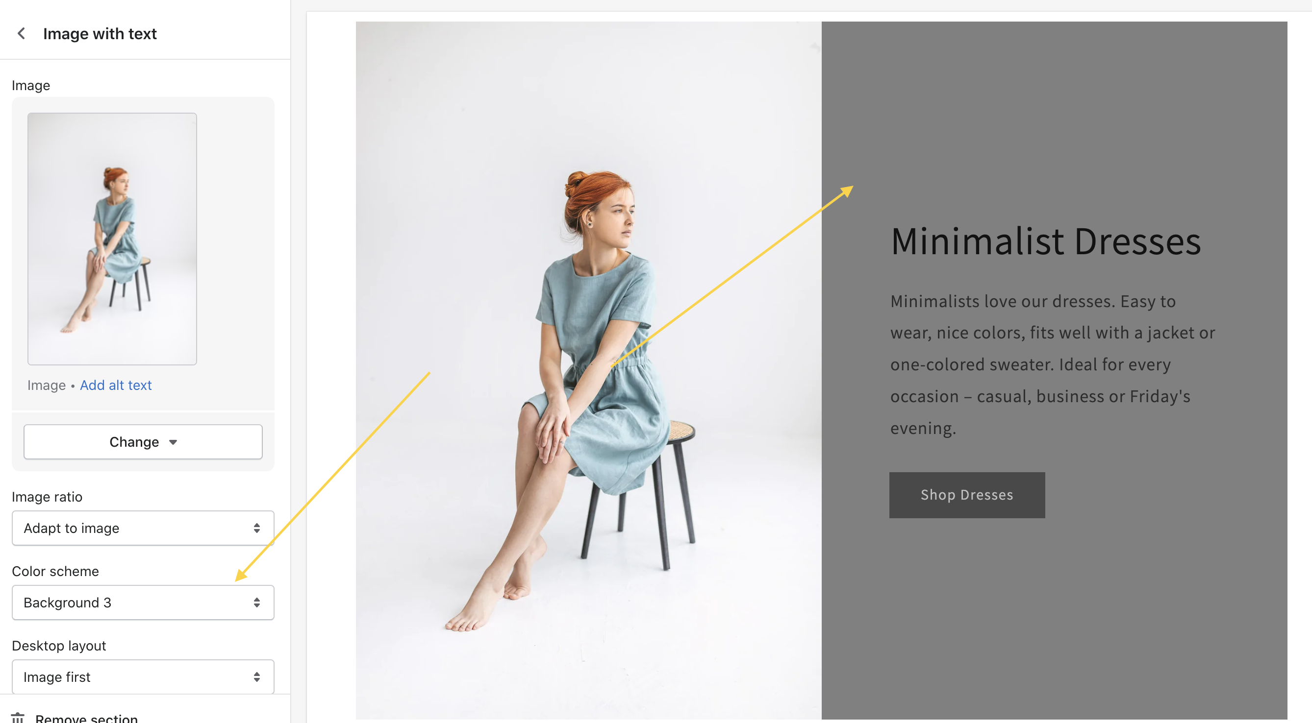
Important note: You may need to assign further CSS properties to the class .color-background-3. When you change the background color, you may also need to change e.g. the button background or the button label text (to get an entire color scheme).
I hope you find this article helpful and successfully add additional background color to the theme settings. If you have any questions, feel free to get in touch with us. We’ll be happy to help you out.